A new MapsAlive plugin is now availble for Omeka Classic. It lets you display content from your Omeka items on an interactive map created with MapsAlive interactive map software. For examples, see the interactive maps page for the Southwest Harbor Public Library in Maine.
A very interesting plugin, @gsoules . Congratulations!
I see one can customize the HTML code for the popup, if I’m not wrong. So I was wondering whether there’d be a way to keep a constant size for the thumbnails: from what I see, popup window and thumbnails size seem to adapt to both number of thumbnails available and window size, while some might prefer to use a constant size (adapting only to window size) for the thumbnails and/or for the popup window.
Thank you Daniele. Good to hear from you. I’m not quite clear on what you are asking, but this might help.
You can set the maximum and minimum size of the popup on the MapsAlive Popup Size And Appearance screen. You can control the size and layout of the Omeka content that appears in the popup using CSS that you code on MapsAlive Custom HTML screen.
However, in order for both the map and the popups to be responsive on any size browser, and for the map to display in Mobile Mode on small devices, MapsAlive will scale the popup and/or change its width or height as necessary. As such, it’s best to use HTML and CSS that display images using max-width, either 100%, or less if for example you wanted to display the thumbs in columns using CSS Flexbox.
Additionally, since MapsAlive does not know anything about the HTML containing your Omeka content, and because it displays a callout (arrow) pointing from the popup to the hotspot’s marker, it calculates the popup height, width, and position based on what you set for maximum and minimum dimensions, not on your HTML content. Therefore, your HTML and CSS must be fully responsive within the popup container.
If this has not been helpful, please give a specific example and/or a screenshot, and I’ll try again.
Hello George. Many thanks for the explanation, I think the plugin being built with responsiveness in mind is a very good idea.
With my question, I was wondering more about the size of the thumbnails. Let me explain with two pictures from one of your example maps:
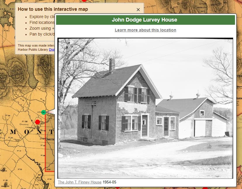
This is the popup with a single image.
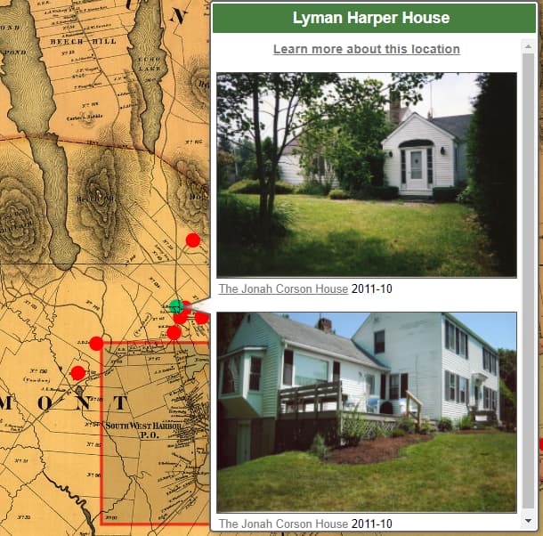
And this is the popup with two images.
I was wondering whether there would be a way to keep the thumbnails sizes consistent, i.d. same size for all of them: when hovering different points on the map, I find it a bit confusing that the images keep changing their size, according (I suppose) to the amount of images available.
Thanks for the clarification Daniele. The images get smaller because MapsAlive scales popups based on the available browser area. I can tell from your second screenshot that the browser was not very tall. If the browser was taller, the popup would be taller and wider and the images in the second screenshot would be as wide as the images in the first screenshot.
It’s like that because MapsAlive scales the popup’s width and height to maintain the popup’s aspect ratio. This is by design to keep the entire image visible without the need to scroll. It works very well with just one image, but as you point out, not so well with multiple images.
I did an experiment where I was able to override the scaling behavior with CSS like this:
#maPopupPanel {
   min-width:600px;
}
However, with that CCS, the popup is no longer responsive when the browser is narrow. The image gets cut off on the right. Maybe that could be addressed with smarter CSS e.g. using calc or clamp.
I hope this response is helpful.
But the size of the browser (Chrome) window was not changed between the first and the second snapshot, so I would expect (if I got correctly your explanation) the popup to be exactly the same size; and yet, the single image is quite bigger than any single one of the two.
That’s what does seem weird to me.
Yes, that’s correct. The popup with one image can display at it’s full height and width because there is enough vertical space in the browser. The popup with multiple images cannot display at full height and so it scales down to fit within the available vertical height which makes it narrower. The popup’s responsive behavior prevents it from extending past the bottom of the browser window and so it scales down, preserving its aspect ratio, which makes the images smaller.
Note that on a mobile device, the popup is replaced with a slide-out panel that does not scale, and so all of the images appear at the same size.
Exactly. So, I was wondering whether a different approach would also be possible: given a constant size of the thumbnail, the popup scales down (or up) to show the content. I would personally prefer that to a constant (maximum) height of the popup with different image sizes (being just a matter of preference, it could be some setting in configuration, if it was at all possible). Just my 2 cents, of course 
I always appreciate your input Daniele. To be clear, a configuration option like you suggest would have to be added to the MapsAlive web application, not to the MapsAlive plugin for Omeka.
This topic was automatically closed after 250 days. New replies are no longer allowed.