Good afternoon – I’ve got a question about mapping UX consistency, around markers.
Omeka 3.2.3 (can’t upgrade right now)
Mapping 1.6.0
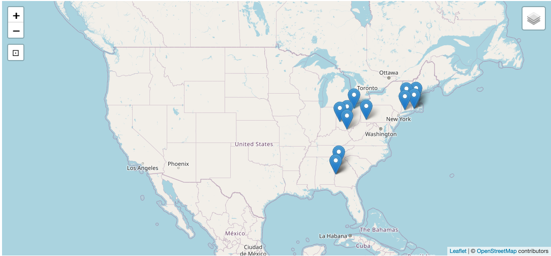
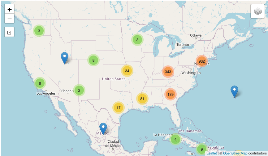
At roughly the same zoom level, with (I think) the same basemap, the map in a Map Browse page and the map in an Item page seem to approach clustering differently and therefore look different to a site viewer. I’ve tried to show this in the attached screenshots: Map block on top, Map Browse page on bottom. Now, obviously the Map Browse page has many more markers in it, but the colored clusters do happen when there are as few as 2 markers in a particular area (AZ/NM) and I would expect to see the same in the Map block (GA dyad, among others). Is this something I can do something about? (In these versions of Omeka and the Mapping module, natch.)
On the map block, do the markers cluster at all when zoomed all the way out? Do you have “Disable clustering of map features” turned on in site settings? Clustering is calculated automatically by the Leaflet.markercluster plugin, so it’s difficult to say why there are differences between the two maps.
My apologies for the delay – rabbit holes, brush fires.
We’ve got no setting for disabling clustering in a site, nor does the module have global settings (as far as I can tell), so our version of the module (1.6.0) must be from before that setting.