Hello! I have been using the Item Carousel Block module as a way to highlight item sets–I have some carousels that only feature one slide at a time, and others that feature three or four at a time, depending on the size of the collection. This module works great on desktops, but not so great on mobile devices. The issue is that those carousels with multiple items aren’t responsive, so everything overlaps and causes accessibility issues. (I’m attaching an image below). Carousels with one item work fine. Does anyone have any advice on what to do?

That looks like a possible bug. Do you have a link to a live example to share?
Hi,
Looking at your website, we can see that the carousel always displays 4 slides and does not use breakpoints:
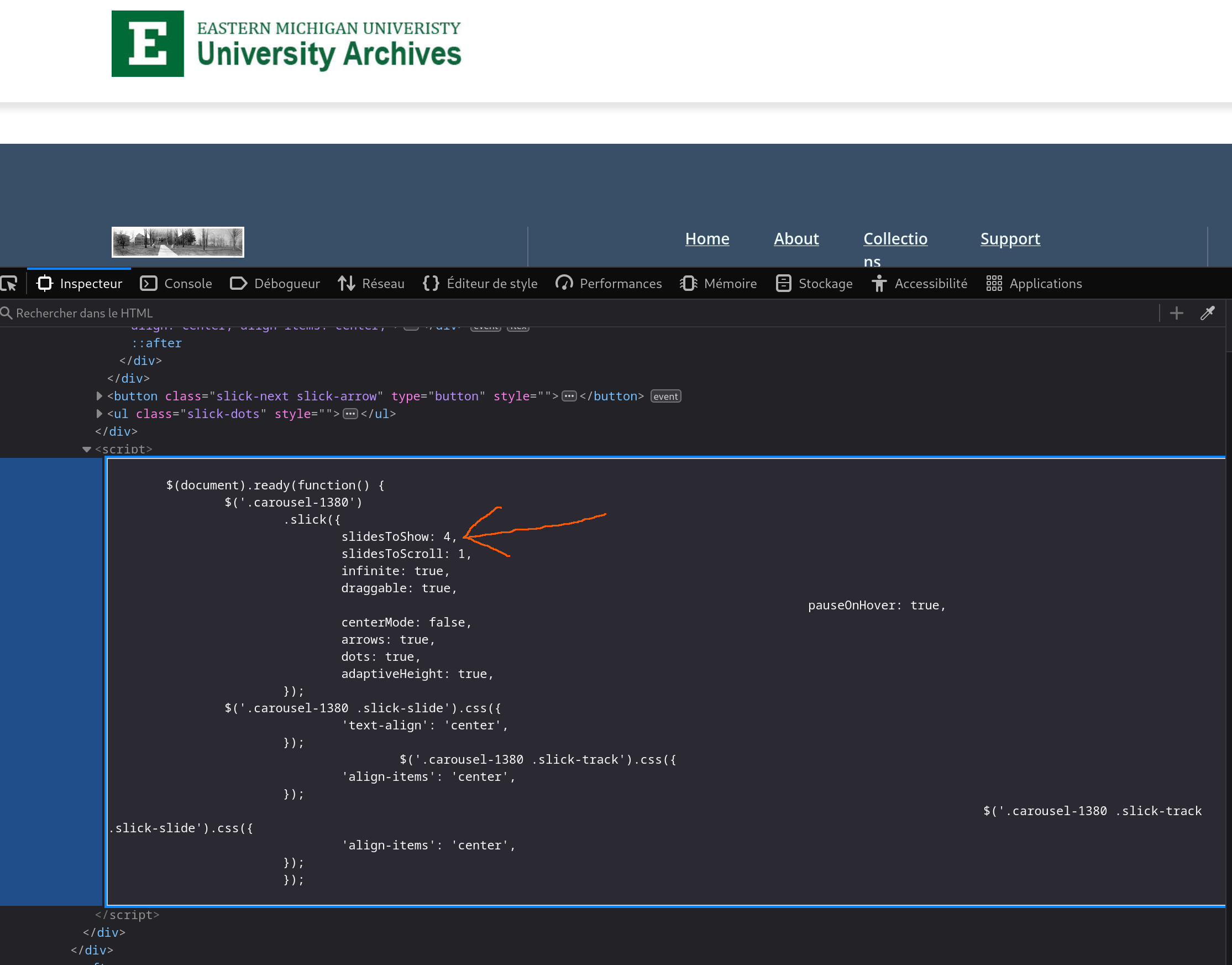
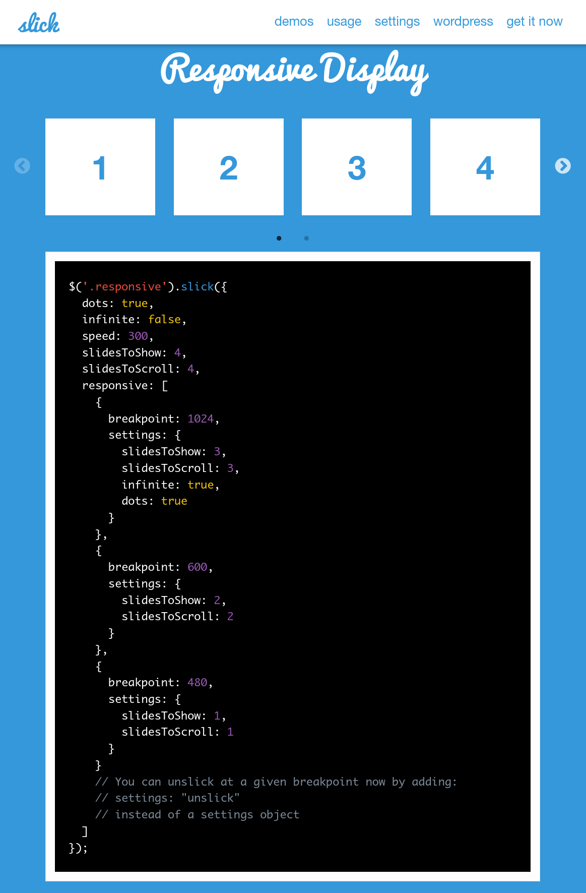
To have the carousel adapt to the width of the device, you should specify appropriate breakpoints as indicated on this page: slick - the last carousel you'll ever need (see the “Responsive display” section):
If there is no way of doing this through the config interface, I guess you’ll have to write some JS.
Hi Kim, here’s a link for a live example. Out of the Margins: Voices from 1279 · EMU Archives · EMU Archives Omeka
Hello, thanks for this resource! I’ve tried putting in those breakpoints but am not seeing any results yet. But, I’m not a web developer by any means and all of this is still relatively new to me, so I could be doing it incorrectly. Do you have an idea of where a good place to put this code would be, so that I don’t have to make each page responsive individually? I really appreciate any advice you have to offer!
I was able to replicate this on one mobile browser but not another. Things don’t look great at 5-wide no matter what, but the issue does seem to vary by browser.
I can understand why you want 5 wide on a desktop computer, if that’s the size of your thumbnails, but to be more responsive to different device widths I suggest multiple page blocks intead: several single-item carousels, maybe. Then the grid mode of the Omeka page will accommodate some more flexibility.
Otherwise, we could maybe add functionality to the carousel code itself to ignore your 5-wide settings when that’s just not possible, and take it down to fewer slides depending on the browser width. Would you prefer that solution? That way you’d still have 5 on desktop but maybe 4, 3, 2, or 1 on other devices.
I’ve logged this as an issue here: Flexibility for multiple slides · Issue #22 · omeka-s-modules/ItemCarouselBlock · GitHub
Why not just add settings to allow the user to specify the breakpoints by himself? Looking at the resource mentionned above could be a good point to start from, don’t you think?
@khacanya Sorry for the wait on this–we’ve added a breakpoint value to the Item Carousel Block settings. It’s in the git repository to pull now and will also be released as an update within the next day or so.
The width breakpoint is set to 820 px by default, as it seemed a good compromise between browser and mobile viewing in our testing, but feel free to adjust as needed.
This topic was automatically closed 360 days after the last reply. New replies are no longer allowed.