Hello All,
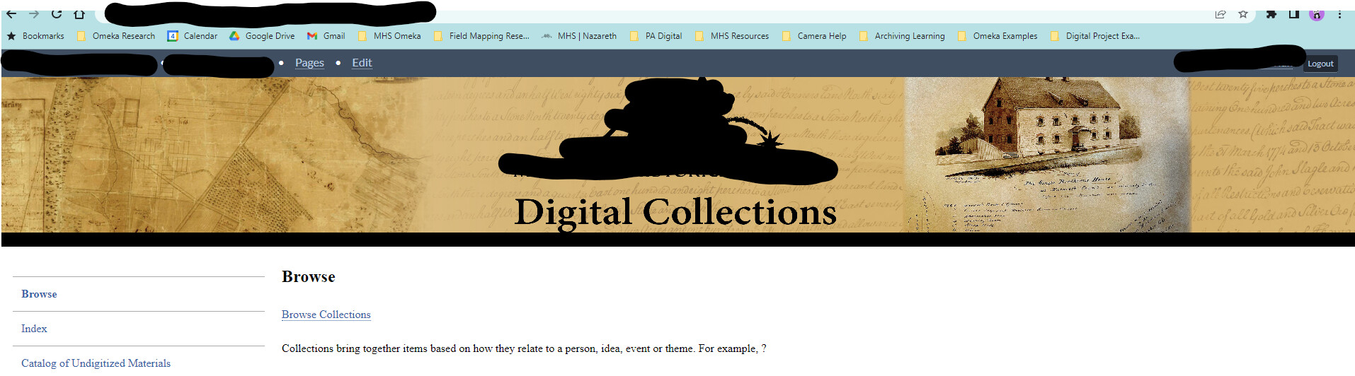
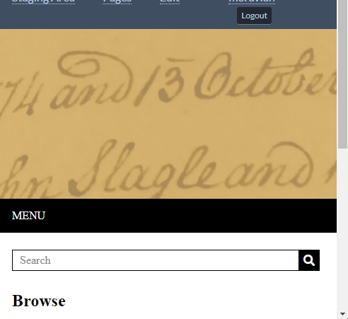
I am using the Thanks Roy theme and the header image is getting cut off on the top and bottom when viewing in full screen. When viewing on mobile, the header image zooms into a small part and the logo etc is lost completely.
I have tried resizing etc. but have not found the magic size that prevents this.
I can remove the header entirely with the CSS editor, but then I need a way to add the header image back with the proper behavior.
Not familiar with the specific theme, but wouldn’t the trick outlined in this post be helpful? Of course, duly adapting the CSS as shown there. In your case it could even be simpler, as you probably don’t have built in padding there (but I write this without having checked the theme, there’s probably an even easier way)
(if there’s no padding, then all the margin adjusting part there doesn’t matter, and it just boils down to setting width to 100% and auto, I guess)