I have recently switched my site over to the Freedom theme and prefer it over the other themes in every aspect except when trying to create an exhibit with exhibit builder. The first issue I am running into is that it creates a page break/ line whenever adding a new block on a page, making it difficult to vary image position and have what appears as continuous text. If I want to use different layouts all on one page, then there is a page break/ line between every layout block, which does not seem to occur with any other theme such as seasons. Is it possible to change this with the CSS editor plugin or is there another solution?
An additional issue is that if I choose the carousel or gallery layout, then the images are massive, taking up most of the window and requiring the user to zoom out just to see the image/ images. Please share any thoughts on how to fix these issues as I would prefer not to switch from the Freedom theme. I appreciate any feedback or comments and thank anyone who replies in advance!
Hi @pshall, I’m a bit confused since this post is tagged as “Omeka S.” I think you might be referring to Classic. Could you confirm? Also, would you mind attaching a few screenshots so I can better understand the issue?
Hey, thank you for responding @nelsonamaya. You are correct, I am using Omeka Classic and accidentally chose Omeka S. I am using Omeka for a class project through reclaimhosting.com and was initially unsure of whether that was the Classic or S version. Because I am a new user, I am only able to attach one image to the post so I attempted to put all the images into one file. Hopefully that does not lead to confusion.
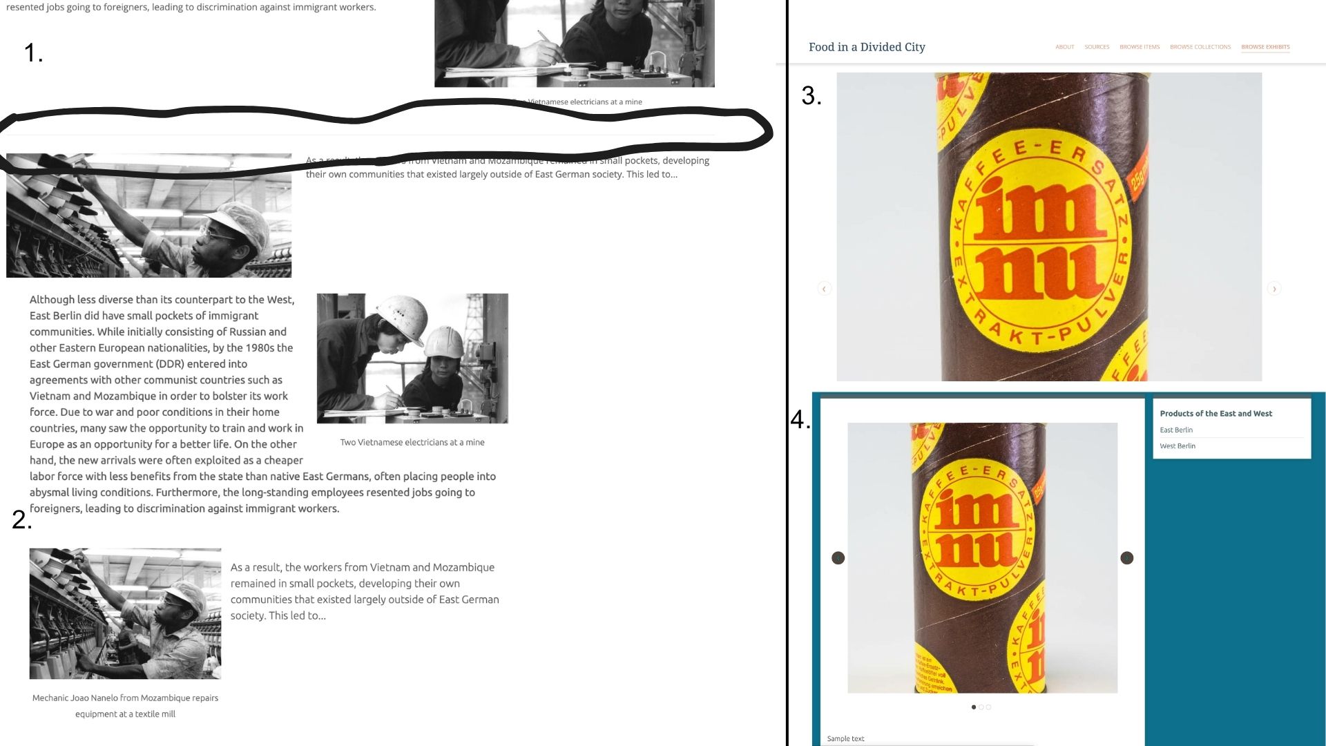
This image shows the page break/ line that I am referring to in between blocks.
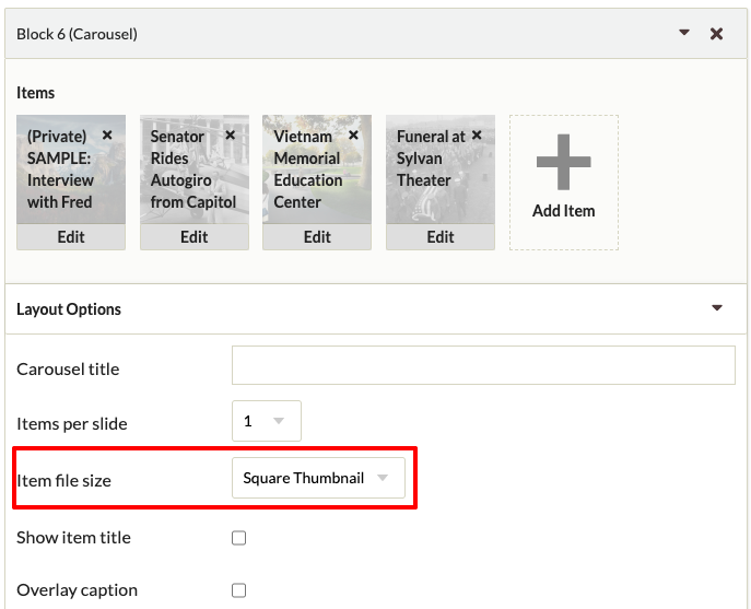
Whereas this screenshot shows the same exhibit, but using the seasons theme. As far as I can tell, Freedom is the only them that places a line between each block that is added.
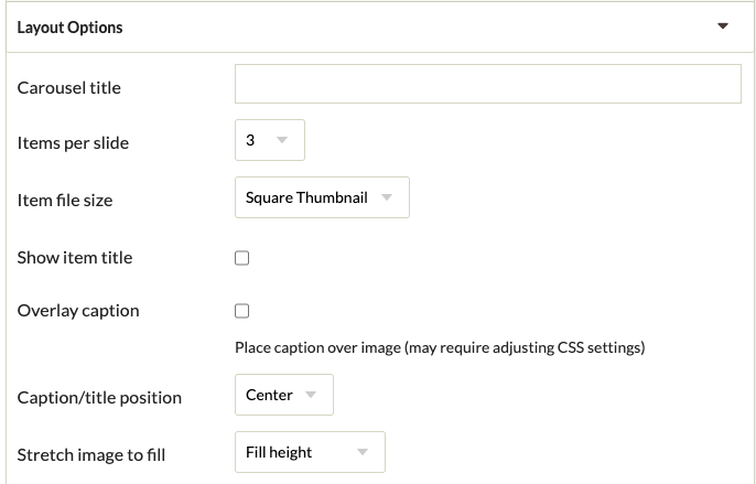
Not sure how easy it is to tell from this image, but when placing the carousel layout block in the Freedom theme, the images are extremely large within the window. I realized after I made my post that on a mobile version they appear more in proportion to the overall window.
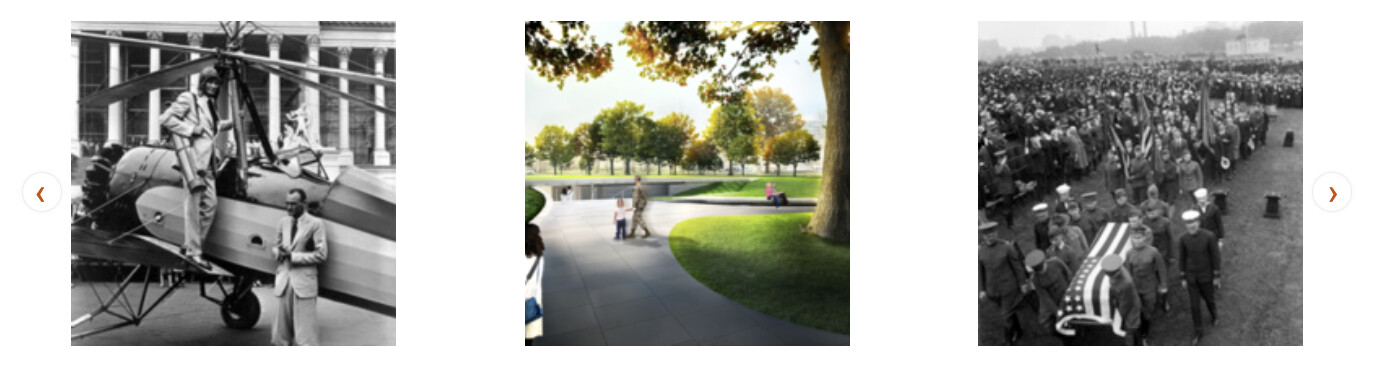
Again, this is the carousel feature in seasons, which shows the carousel in much better proportion to the overall window in comparison.
I hope these images clarify my original post. Thank you again for reaching out so quickly.
Sure, you can edit any style using the CSS Editor plugin. For this specific case, you can add the following to the custom CSS (you can optionally reduce the space between blocks by setting padding-bottom: 0;):
You’re probably using “Full Size” in the “Item file size” option under the Carousel Layout Options. You can change this to a more convenient option like “Square Thumbnail” or “Thumbnail”:
Thanks for these tips, I think they will certainly help with my formatting issues. By switching to more than one item per slide for the carousel the images now appear at a more reasonable scale within the page window. I messed around with the different options such as thumbnail and the stretch image to fill and it didn’t seem to adjust the overall size very much when one item per slide is selected, but I will be adding many items into the carousel so having multiple per slide is not a problem. Thanks again for your help with these issues. @nelsonamaya