Thanks for your reply and the update.
As for the issue I mentioned, having a closer look, I see it is related to the responsiveness, but I feel it is still a bug. If I have more than ~1400 horizontal pixels, then everything looks fine. But I originally checked this on an old laptop, so I was below it. I understand that most modern computers have higher resolution, but still, I feel the full width should kick in at much lower resolution (say, under 1024px), similarly to what happens in other pages, and even then, move to the menu style for mobile devices, again as happens in other site pages.
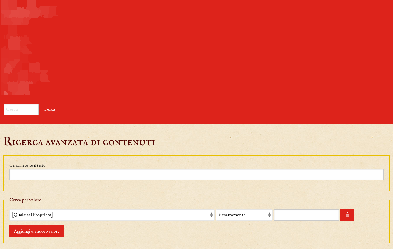
Anyway, for reference here are the screenshots (intentionally blurred on text):
Here is a random item, with “full height column”, menu on the left, all as expected, and as I see it on most pages (site pages, items, collections, etc.)

Here is an example of what I meant, on the
/map-browse/ page. The navigation is on the top-left, but the div with the navigation goes full width:
Same with advanced search: