Typically, to have a background image that scales with the size of its container, you’d set a style like background-size: cover (or contain, or some other options).
If you’re uploading a “header background” image on the “Configure Theme” page on Thanks Roy, I believe it should already be set to full width and dynamic (background-size:cover). In the CSS that gets generated in the header of the page:
header {background:transparent url("your-image-here") center left no-repeat;}
and in the style.css file
header {background-size: cover !important;}
Between those two you should already be seeing it work. If I’m reading what you wrote correctly.
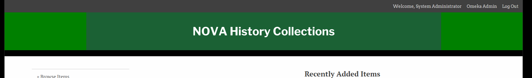
I would suggest that, instead of having the image be full-width and responsive, you should do custom CSS to change the background colour of the header div to that same green in your image (whatever your green is, not #008000). And then the rest of it looks like this:
header {
background:#008000 url("https://history.nvcc.edu/files/theme_uploads/8609695e005e5a8019930a102ae32100.png") no-repeat center !important;
height:145px;
}
which will centre the text and stop it from stretching both tall and wide. And give you the header height I imagine you want, based on the height of the image.
The !important bit overrides the earlier “cover !important” in the style.css to make sure it’s not ignoring your input.
I am having a similar problem with the banner image on https://mcwi.omeka.net/ not resizing on different devices. I installed the CSS Plugin, but am unsure what url to include in the CSS and whether the CSS in the above example is the right thing to do. I am using the Santa Fe theme.
Many thanks in advance!
Hi there. We’ve just released Santa Fe v2.6. It should now include better responsive styles for the site logo image, as well as a setting for a responsive header image.