We’re using a custom theme. We want to use faceted browse but we’d like to change some of the appearance of the list (positioning, etc).
What’s the right way to set up the files in our theme to modify the appearance of the module pages and pieces?
We’re using a custom theme. We want to use faceted browse but we’d like to change some of the appearance of the list (positioning, etc).
What’s the right way to set up the files in our theme to modify the appearance of the module pages and pieces?
Hi, I’m just looking at Faceted Browse right now and would love to know what you have in mind, and if you managed to set this up satisfactorily on your own.
Hi @AllanaMayer, I’m not the OP, but wanted to jump into this thread because I also have a question about controlling the look of Faceted Browse.
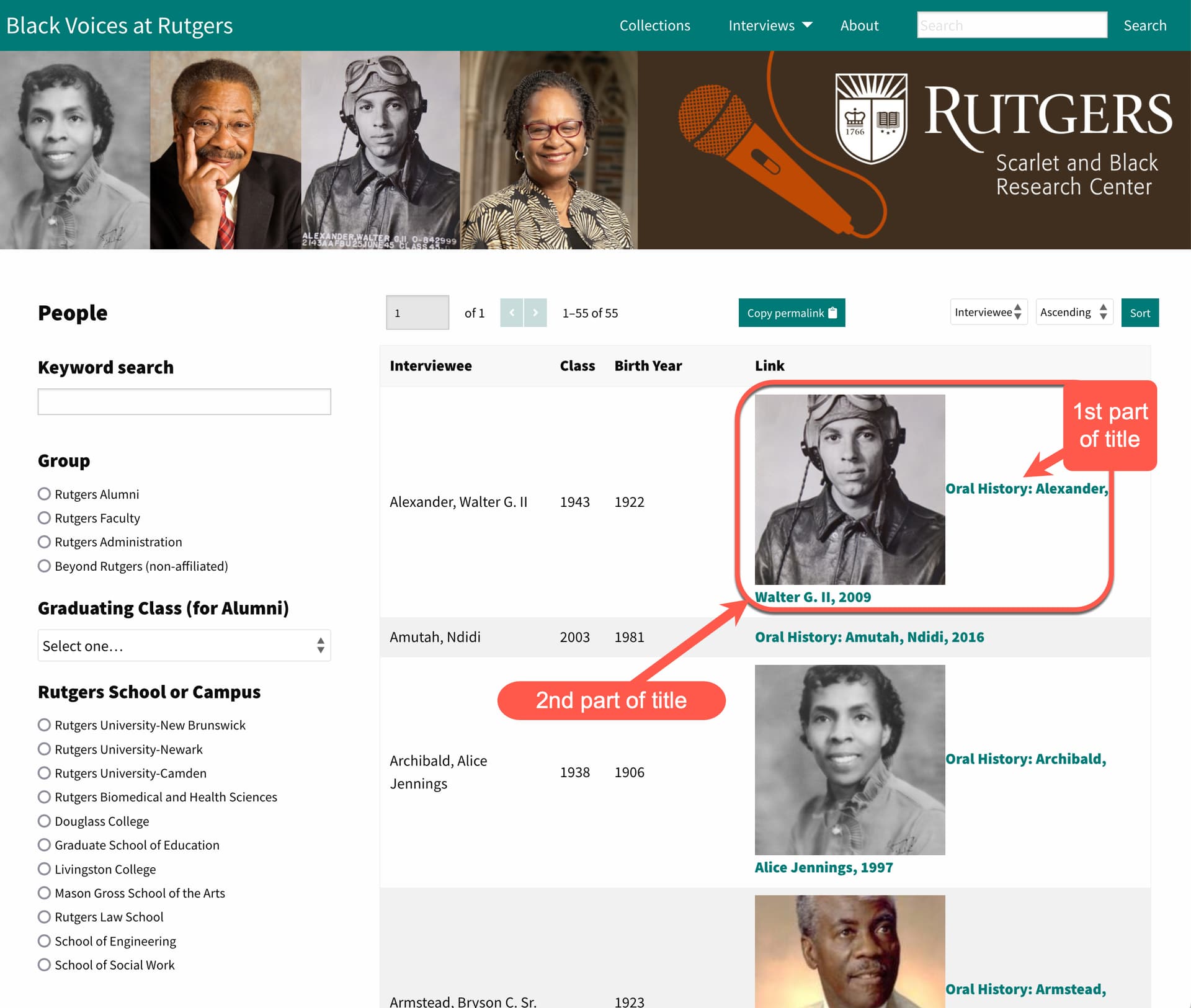
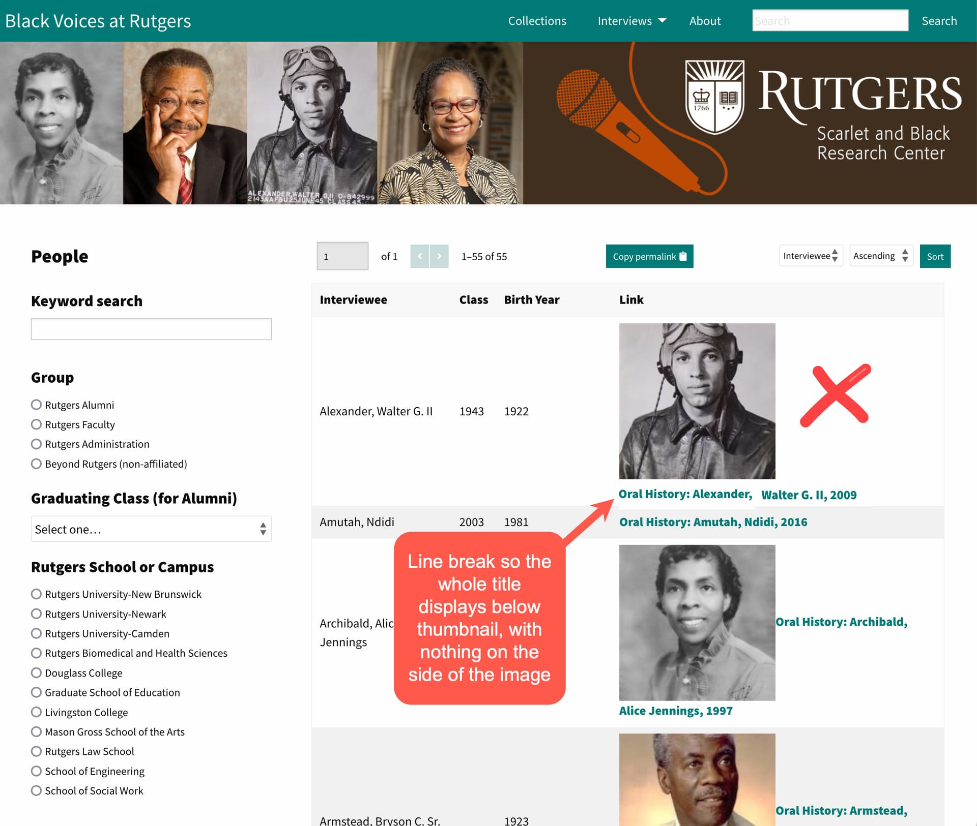
I use the Foundation theme for several sites. Particularly, here’s one of my Faceted Browse pages: https://scarletandblack.rutgers.edu/data/s/black-voices/faceted-browse/4. As you see highlighted in the screenshot below, when there is Media attached to the item, the thumbnail image and the hyperlinked title of the item are spaced in an odd way. The image is in-line with the hyperlinked text, with no padding, so they’re practically touching each other; it also creates an awkward line break, with the first and second parts of the title quite far away from each other, and with the second half of the title displaying directly below the image.
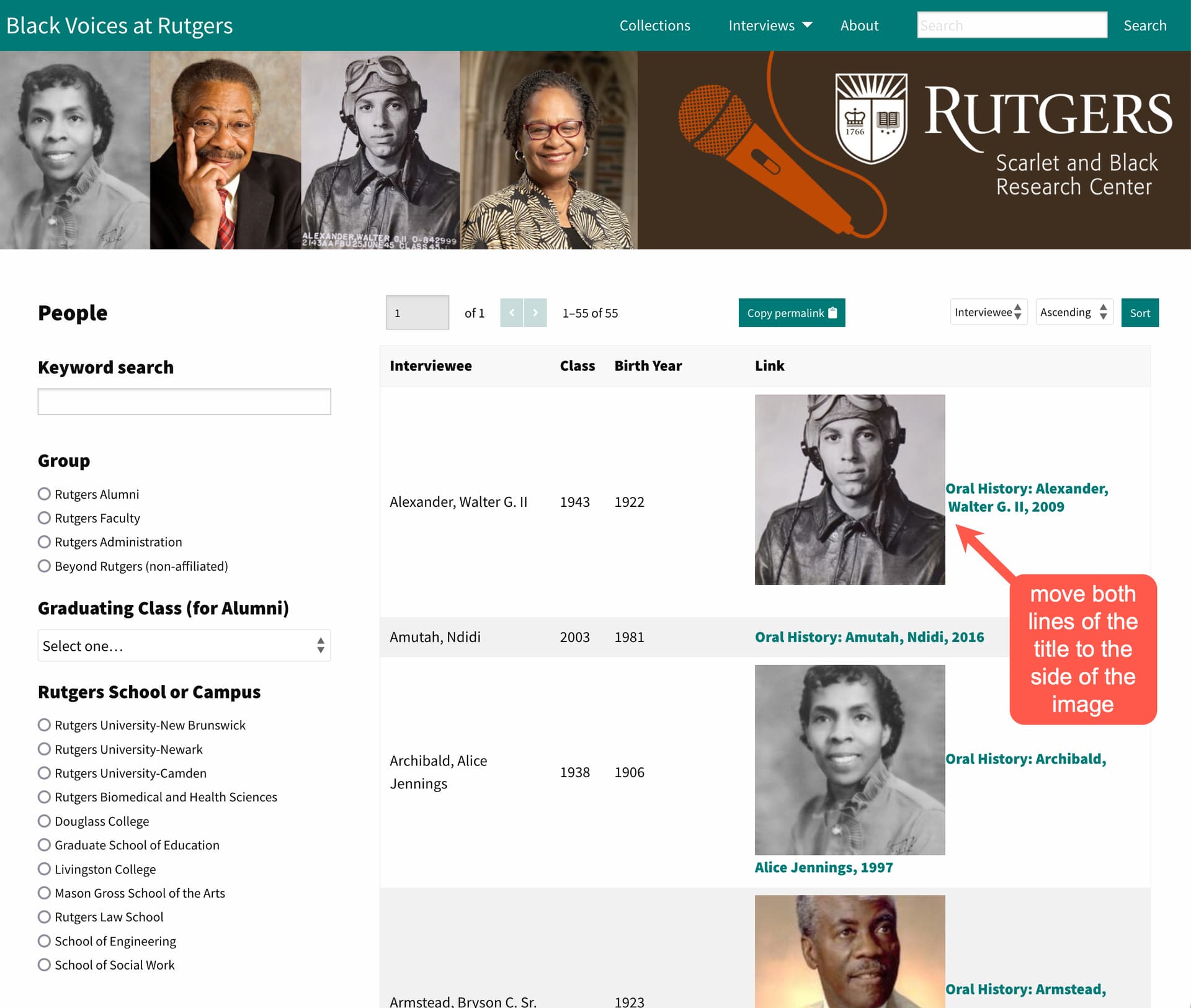
I would like to achieve a more streamlined look for the item titles displayed in the Faceted Browse table. For example, like this solution #1:
Or this solution #2:
I’m not sure if this is controlled by the theme or by the module itself. Is there something that can be done to achieve this small change?
For #1, use the CSS Editor module and add this:
.resource-name {
display:inline-block;
}
For #2, put the following in CSS Editor:
a.resource-link {
display:flex;
align-items:center;
}
a.resource-link img {
margin-right:5px;
}
Adding some whitespace to the right of the image is optional, but I think it’s probably a good idea.
I don’t have a good Omeka S site to test these on at the moment, so let me know if they work as intended.
Thanks so much, @AllanaMayer. I tested both CSS snippets, and they both work as expected on the computer screen. On a small mobile screen (which is generally not the best for Faceted Browse anyway) solution #2 doesn’t look great (the resource title floats partially outside the boundaries of the table), so I decided to use solution #1. You can see the result at https://scarletandblack.rutgers.edu/data/s/black-voices/faceted-browse/4.
This topic was automatically closed 250 days after the last reply. New replies are no longer allowed.