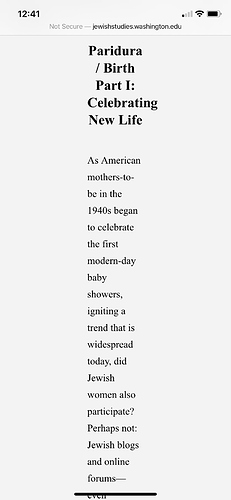
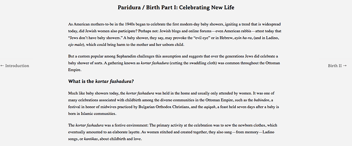
Hi there - after publishing our site, it came to our attention that the mobile experience was quite off. Any way to make it so that the site is better fit for a mobile experience - mainly with regard to the padding? The problem right now is that I increased the padding because the text is easier to read when the lines are shorter, but that seems to have become quite exaggerated on the mobile version. I’ve included images below. Any help would be much appreciated!
I’m using the big picture theme.
You can use CSS media queries to adjust your rules based on viewport/screen width, for example…
// for screens larger than 640px
@media all and (min-width:640px){
    // put rules here, e.g.
    .your-container{
        padding: inherit;
    }
}
// for screens smaller than 640px
@media all and (max-width:640px){
    // put rules here, e.g.
    .your-container{
        padding: 0;
    }
}
Here’s some more info.
This topic was automatically closed 250 days after the last reply. New replies are no longer allowed.

